Go back
Go back
Misa AI — Designing a Voice-Powered Bookkeeping App for Nigerian Small Business Owners
Misa AI — Designing a Voice-Powered Bookkeeping App for Nigerian Small Business Owners
Misa AI — Designing a Voice-Powered Bookkeeping App for Nigerian Small Business Owners
Background story
Background story
Picture this, it's a busy Wednesday morning at a POS stand in Lagos. Customers are queuing, cash is moving fast, and the operator, let's call her Chioma, is mentally tracking every transaction. No spreadsheet. No app. Just memory and a notebook she'll update later, if she remembers.
By end of day, something won't add up. It almost never does.
This is the daily reality for millions of small business owners across Nigeria. Not because they're careless, but because the tools built for financial management were never built for them. Most bookkeeping apps assume you have a quiet moment, a steady internet connection, and the patience to tap through five screens to log a single sale. Chioma has none of those things.
The problem isn't that these business owners don't want to track their finances. It's that every solution on the market asks too much of them, and gives back too little.
KudiTraka saw this gap, and had a vision for something different. A voice-powered AI that would let users manage their bookkeeping the same way they already communicate: by speaking.
My role
My role
Lead Product Designer
Lead Product Designer

Project Timeline — 12 Weeks
Project Timeline — 12 Weeks
Weeks 1–3 — Discovery Research, competitor analysis, and a contextual interview with a POS operator from the waitlist.
Weeks 4–6 — First Draft + Founder Review Early wireframes and conversation flows. Founder feedback flagged the onboarding as too formal — scrapped and rebuilt.
Weeks 7–9 — User Testing + Iteration Tested with waitlist users. Key finding: users couldn't tell if the app had heard them. Redesigned the listening indicator and added verbal confirmation to close the loop.
Weeks 10–12 — High-Fidelity + Handoff Final UI, refined AI response language, and edge case coverage before sign-off.
The Call I Almost Didn't Take
When KudiTraka reached out, they led with a caveat: "Two designers before you couldn't crack it." That should have been a red flag. Instead, it made me lean in.
The idea was bold, a voice-powered AI bookkeeping app for Nigerian small business owners and POS operators. People who spend their days on their feet, handling cash, logging sales by hand, and making financial decisions based on gut feel rather than data. The previous designers had tried to build something elegant. What they built was something confusing.
I didn't want to make the same mistake. So before I opened Figma, I closed my laptop.
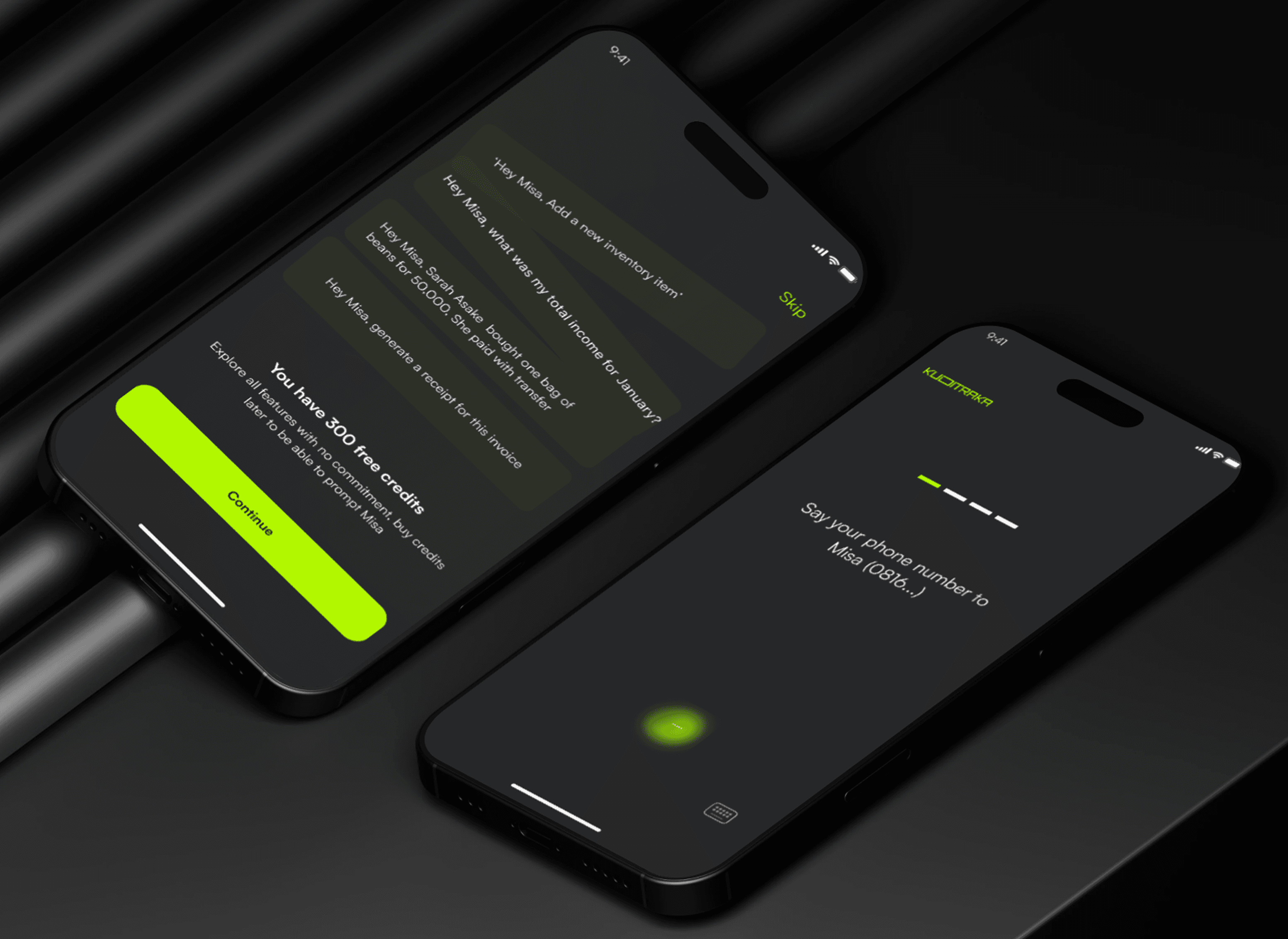
Onboarding mockup screens for Misa AI, designed to create a smooth, human-centered first experience that introduces users to the app effortlessly.
Understanding Before Designing
My first move was to ask more questions, not about the product, but about the people it was supposed to help.
KudiTraka had done early market research, and one thing stood out: they already had a waitlist. Real people, eager to use this thing before it even existed. I saw that as a gift. I reached out to one of them — a POS operator — and asked if she'd walk me through a typical workday.
She did, and what I heard reshaped everything.
She wasn't struggling with technology, she used her phone constantly. She was struggling with friction. Every financial app she'd tried felt like it was designed for someone else: someone with time to sit down, navigate menus, and type figures carefully. Her reality was different. She was managing transactions, answering customer questions, and tracking inventory all at once. Stopping to open an app and tap in numbers wasn't just annoying — it was a workflow she simply couldn't afford.
That one conversation gave me the insight that anchored the entire design: the interface couldn't demand her attention. It had to fit into the gaps in her day.
The Design Challenge I Hadn't Faced Before
Here's where I had to be honest with myself: I'd never designed a Voice User Interface before.
Most of my instincts as a designer are visual, I think in layouts, hierarchies, and states. But voice is none of that. It's sequential, conversational, and unforgiving of confusion. There's no "back button" when someone mishears a prompt.
Rather than pretend I knew what I was doing, I studied. I spent time analysing how Google Assistant, Alexa, and Siri handle conversation, not just what they say, but how they recover from misunderstanding, how they signal they're listening, and how they keep interactions short without feeling abrupt. I also explored how generative AI could make the experience feel less like a command-line and more like a capable colleague, one that anticipates context instead of waiting to be told everything.
The biggest shift in my thinking: voice design is conversation design. Every prompt is a micro-UX decision. Every response shapes whether the user feels confident or lost.
The Design Challenge I Hadn't Faced Before
From the market research and a deep understanding of user needs, it became clear that our target audience isn’t very tech-savvy, even though they own smartphones.
So, we leaned into something familiar: voice calls.
We designed a solution where users could simply speak to manage their daily bookkeeping tasks.
Imagine a POS operator handling transactions without ever touching a screen or a small business owner managing sales and inventory without tech stress.
With voice-powered AI, transactions are logged automatically, reducing errors and keeping records accurate. They now get instant updates on stock levels and sales trends — just by speaking — making business decisions quicker and easier.
The Decision That Defined the Product
With my research in hand, the core design decision became clear, and it was a deliberate constraint, not a feature.
Our users weren't unfamiliar with their phones, but they weren't power users either. Complex interfaces had failed them before. So instead of building another app that also had voice as an option, we made voice the primary interface — modelled on something they already trusted: a phone call.
That framing changed everything. It meant:
The onboarding couldn't rely on visual walkthroughs, it had to teach through conversation
Error states had to be handled verbally, with clear, friendly re-prompts
The "confirmation" of a logged transaction needed to feel like acknowledgement, not a system message
The visual UI still existed, for viewing reports, checking history, seeing trends. But the input layer, the part the user touched every single day, was voice-first. A POS operator could say "I sold 3 bags of rice for 4,500 naira" and the app would log it, update her inventory, and confirm back, all without her looking at a screen.
What Shipped
The final design centred on three things:
A natural onboarding flow — Designed to introduce Misa (the AI) as a character, not a feature. The first-time experience felt like meeting someone helpful, not setting up software.
A voice-first transaction layer — Users could log sales, check balances, and ask for summaries entirely through speech. The AI was designed to handle natural, imperfect language — not rigid commands.
A visual reporting layer — Simple, scannable dashboards for when users did want to see the bigger picture. Designed for quick comprehension, not deep analysis.

Impact
Impact
KudiTraka already had a waitlist of 100+ users before I joined, which actually shaped how I worked. Those weren't just numbers; they were real people who had already bought into the vision. That raised the stakes. I had access to them for research, and their feedback directly influenced the design decisions I made.
My contribution was taking an idea that had excited people on paper and turning it into an experience that could actually deliver on that promise.

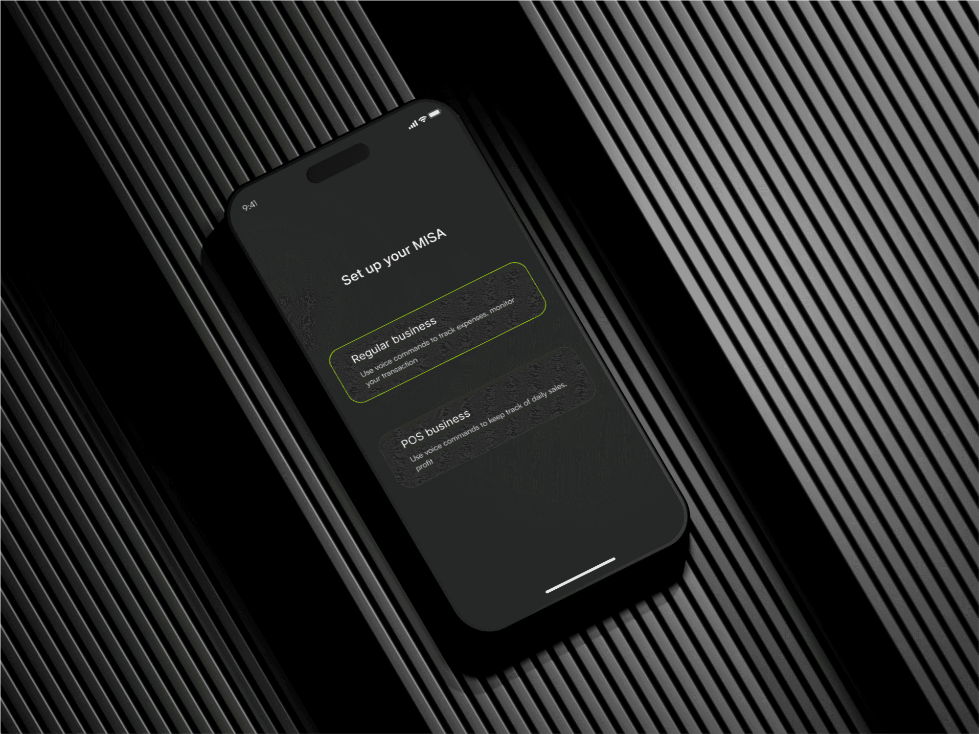
A few selected screens showcasing the final UI design of the Misa AI app.
What I Took Away
This project pushed me into unfamiliar territory, and that was the point.
I learned that designing for voice means designing for trust. Every interaction has to feel like the app gets the user, because there's no visual scaffolding to fall back on. If the conversation breaks down, the whole experience breaks down.
More broadly, it reminded me that the best design decisions aren't always the most inventive ones. Sometimes the right call is to reach for something familiar, a phone call, a conversation, a simple question-and-answer, and make it work harder than it ever has before.