Go back
Go back
Data First Workplace — Website Design | 2025
Data First Workplace — Website Design | 2025
Overview
Overview
Data First Workplace is a B2B SaaS platform that helps organizations improve analytics and BI adoption, measuring things like data trust, literacy, and decision impact. I was brought in to design their marketing website from the ground up.
Data First Workplace is a B2B SaaS platform that helps organizations improve analytics and BI adoption, measuring things like data trust, literacy, and decision impact. I was brought in to design their marketing website from the ground up.
The Problem
The Problem
"BI adoption intelligence" is not a phrase that explains itself. The product solves a real and valuable problem, but only if the right person understands it fast enough to care. The challenge was three things at once: making a complex product feel simple, speaking to two very different audiences on the same page, and building enough visual credibility that visitors trust the product before they even sign up.
"BI adoption intelligence" is not a phrase that explains itself. The product solves a real and valuable problem, but only if the right person understands it fast enough to care. The challenge was three things at once: making a complex product feel simple, speaking to two very different audiences on the same page, and building enough visual credibility that visitors trust the product before they even sign up.
My role
My role
UI/UX Designer, I designed the full multi-page website in Figma over 3–4 weeks. That included information architecture, page structure, visual hierarchy, and the complete design language across every page.
As the UI Designer, I was responsible for bringing the product vision to life visually.

What I Did
Starting with structure
I had the brand and content, my first job was to decide how to organise it. I mapped out each page with the audience in mind: who arrives here, what do they already know, and what do they need to feel before they leave? That thinking shaped every layout decision I made.
Two audiences kept showing up. Data leaders and BI teams who already live this problem, they need depth, specificity, and proof. Executives evaluating whether this is worth their budget, they need clarity and confidence, fast. I designed each page to serve both without alienating
Designing and iterating
I didn't get it right on the first try — and I wasn't supposed to. I went through multiple rounds of design iterations, revisiting layouts, hierarchy, and visual choices as the work evolved. Some sections got redesigned entirely when I realised the first version was solving the wrong problem.
I worked closely with the client throughout. Each feedback round sharpened the design — their input helped me understand what the product truly needed to communicate, and I translated that back into cleaner, more focused layouts with every revision.
The pages
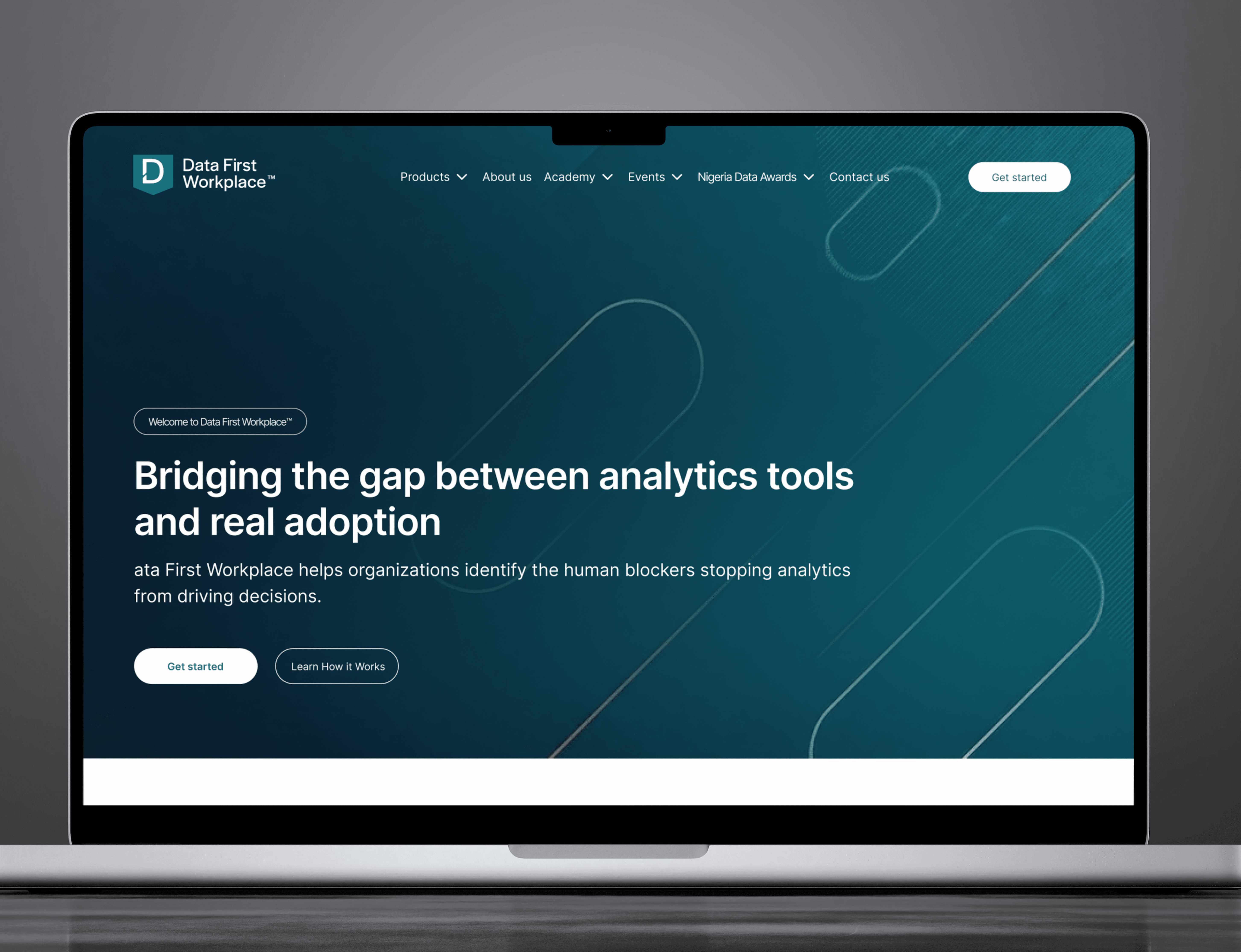
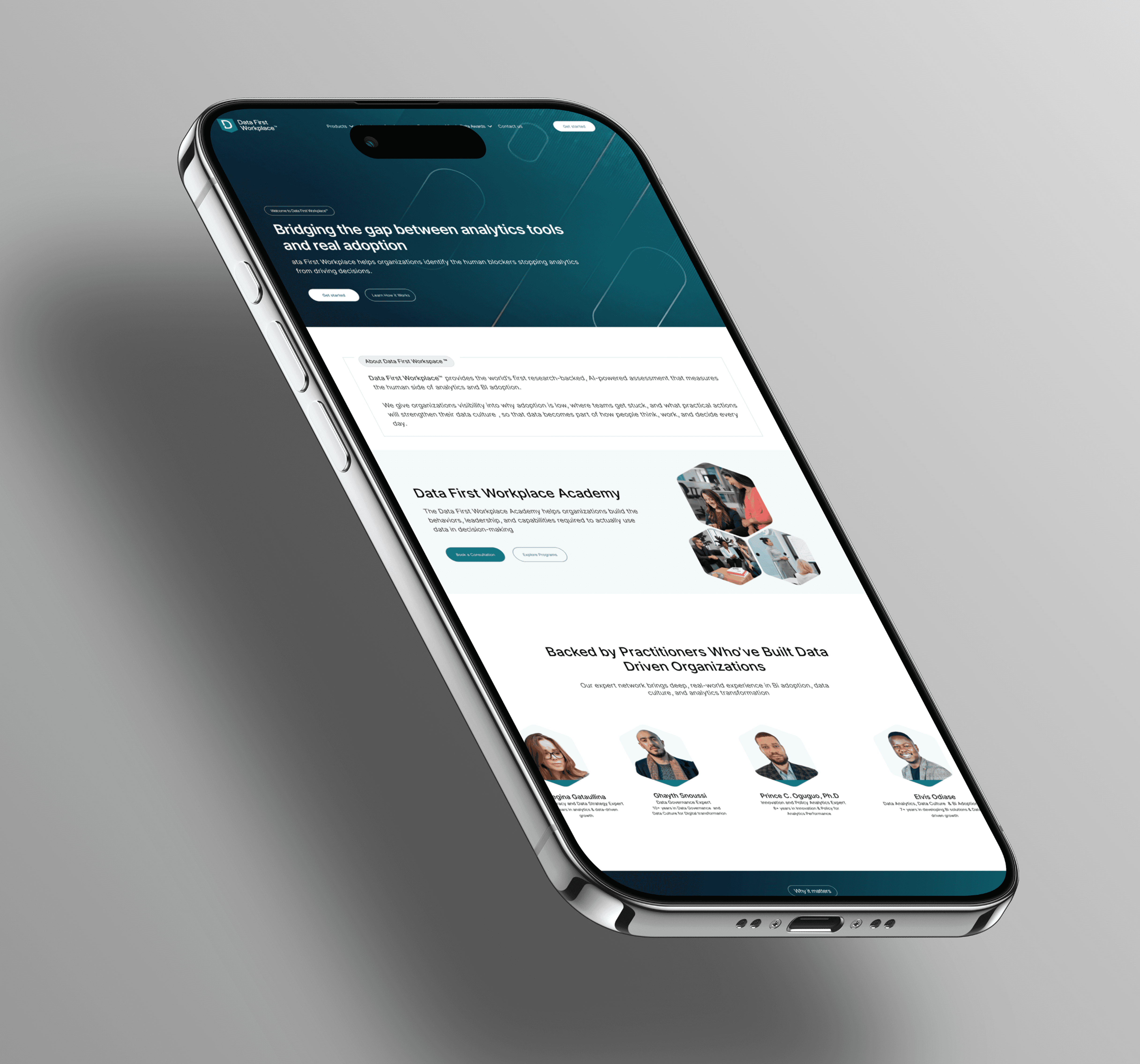
The Homepage leads with the pain, not the product, drawing visitors in before ever asking them to understand anything technical.
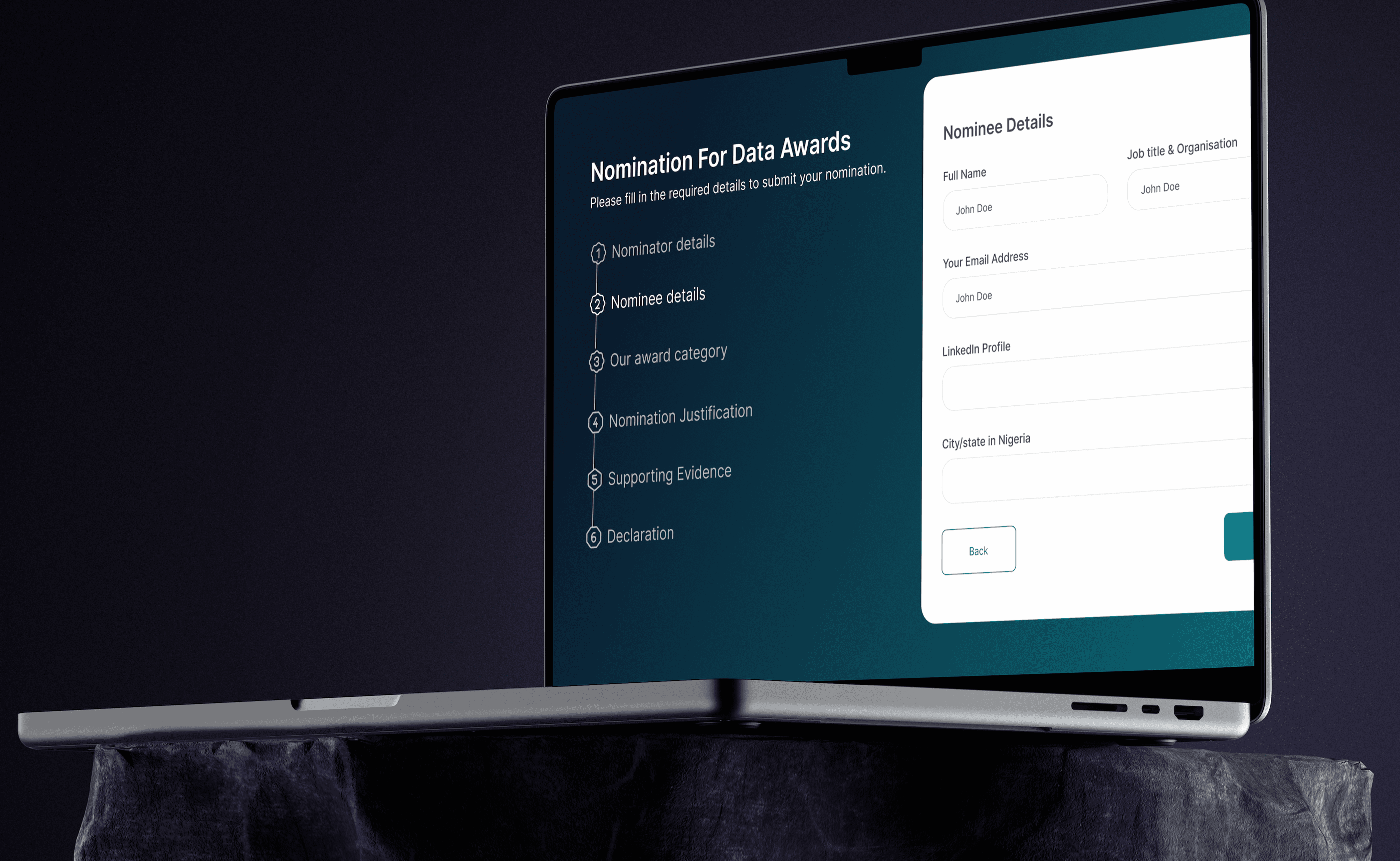
The Features page breaks down a complex product into digestible pieces, each feature framed around what it does for the user, not how it works under the hood.
The About page builds the human side of the brand, giving the platform a face and a reason to exist beyond the product specs.
The Blog was designed to position Data First Workplace as a thought leader in the BI space — clean, readable, and built to keep people on the site longer.
The Contact page was kept simple and friction-free, one clear action, no distractions.
The visual language
Across all five pages, I kept the aesthetic clean and data-forward. Precise typography, intentional spacing, and a visual tone that signals credibility without feeling cold. The kind of design that makes a skeptical visitor think: these people know what they're doing.
What I Did
Starting with structure
I had the brand and content, my first job was to decide how to organise it. I mapped out each page with the audience in mind: who arrives here, what do they already know, and what do they need to feel before they leave? That thinking shaped every layout decision I made.
Two audiences kept showing up. Data leaders and BI teams who already live this problem, they need depth, specificity, and proof. Executives evaluating whether this is worth their budget, they need clarity and confidence, fast. I designed each page to serve both without alienating
Designing and iterating
I didn't get it right on the first try — and I wasn't supposed to. I went through multiple rounds of design iterations, revisiting layouts, hierarchy, and visual choices as the work evolved . Some sections got redesigned entirely when I realised the first version was solving the wrong problem.
I worked closely with the client throughout. Each feedback round sharpened the design — their input helped me understand what the product truly needed to communicate, and I translated that back into cleaner, more focused layouts with every revision.
The pages
The Homepage leads with the pain, not the product, drawing visitors in before ever asking them to understand anything technical.
The Features page breaks down a complex product into digestible pieces, each feature framed around what it does for the user, not how it works under the hood.
The About page builds the human side of the brand, giving the platform a face and a reason to exist beyond the product specs.
The Blog was designed to position Data First Workplace as a thought leader in the BI space — clean, readable, and built to keep people on the site longer.
The Contact page was kept simple and friction-free, one clear action, no distractions.
The visual language
Across all five pages, I kept the aesthetic clean and data-forward. Precise typography, intentional spacing, and a visual tone that signals credibility without feeling cold. The kind of design that makes a skeptical visitor think: these people know what they're doing.
The Result
A complete, cohesive 5-page website that takes a complex B2B product and makes it feel immediately understandable — and worth trusting. Every page was designed to be fully responsive, working seamlessly across desktop, tablet, and mobile. Delivered in Figma, ready for development.
The Result
A complete, cohesive 5-page website that takes a complex B2B product and makes it feel immediately understandable — and worth trusting. Every page was designed to be fully responsive, working seamlessly across desktop, tablet, and mobile. Delivered in Figma, ready for development.
What I Learned
The hardest design problems aren't visual, they're structural. When a product is genuinely powerful but hard to explain, the designer's job is to build a clear path through the complexity. Close collaboration with the client made all the difference, every round of feedback was a chance to get closer to the truth of what the product needed to say.